Flow Component
A Flow component can be used to more easily solve integration problems that are common in your environment.
It enables you to save a flow as a component that can be used in any flow to quickly solve an integration
problem you often face.
Example usage
You have your own custom software solution that your customers need to communicate with. You can build one flow that has all the integration logic for your software solution. This flow can then be saved as a component and the component can be used in all the integration flows of your customers. You can even give it a custom icon to distinguish it from other components
How to create a flow component?
Open an existing flow that you want to reuse or create a new flow. Go to the
settings of the flow and set the Flow Component setting
to true.
Flow component designer
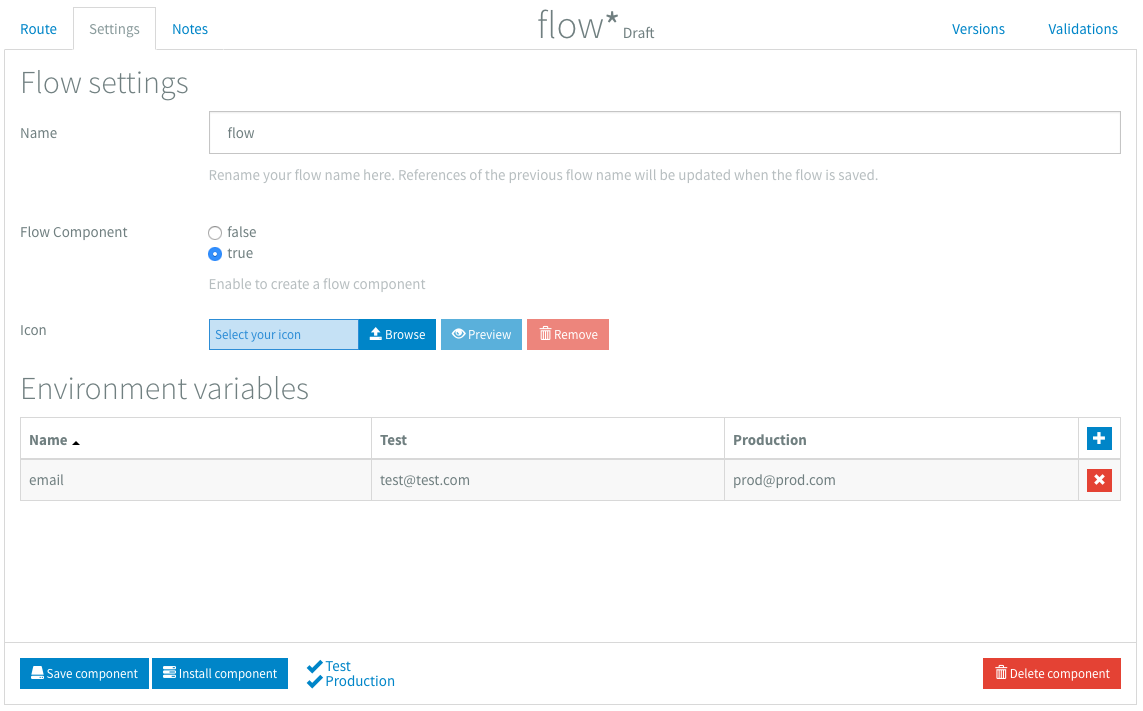
When transforming a flow to a flow component you will see that the designer changes. The error route
disappears and there are other buttons at the bottom. A flow component also has less settings available
and an Icon setting has been added.
Adding an icon
You can add a custom icon to your flow component by clicking the Browse button on the icon setting. At the momenet we only support SVG images and the size is also limited to 50kB. When you've added your icon, you can preview it by clicking the Preview button.
![]()
Controls
While designing your flow component you can save your changes by clicking the Save component button. When you finished your flow component you can click the Install component button.
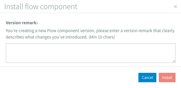
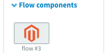
You fill in your remarks and click the Install button to create a usable flow component. It shows up in the component library in the Flow components group.
Versioning
Flow components have the same versioning capabilities like normal flows. When you install a flow component, a new version will be added to your component library alongside previous versions. The version number is added to the name of your flow component like in the picture above.
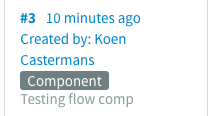
Installed flow component versions are also labeled differently than normal flows in the versions sidebar. They get a Component label.
Validations
Validations are generally the same, but for some components the minimum required connections have been reduced, so you can start your flow component with a transformation for example. This is not possible in a normal flow. Validations messages also show up in the validations sidebars like usual.
Environment variables
You can still use environment variables in your flow component to store values that are used frequently. In a flow component they also act as settings that can be changed when you use it in another flow.
Notes
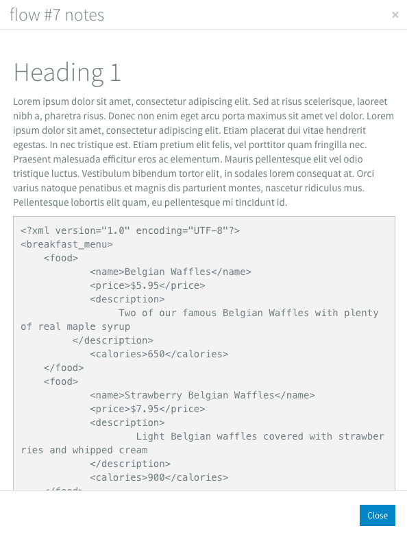
You can use your flow notes to document your flow component. When you click on the blue i icon of a flow component in the component library, a dialog shows up with the notes.
Using a flow component
You can use an installed flow component just like a normal component. You just drag it from the component library to the canvas. There you can connect it how you like. A flow component with multiple last components won't have a connector on the right, because we can't determine to which component the connection should be made.

Properties view
Just like other components a flow component also has a properties view. Next to the title there are two icons. The first icon, with the eye, will redirect you to the designer of the flow component. The second icon, with the i, will show a dialog with the notes of the flow component.
The body of the properties view shows the names of all the included environment variables of the flow component.

Using environment variables to change behaviour
When your flow component is added to a flow, the included environment variables will be added to the environment variables of the flow. In this way you can customise the behaviour of your flow component.
How does it work?
When you install a flow with a flow component, the flow component will be replaced by the underlying flow that you designed and it gets connected to the components that are connected to your flow component.

